Architecture
Graphic Design
CGI & Arts
Contact Me
About Me
Architecture
Graphic Design
CGI & Arts
Contact Me
About Me
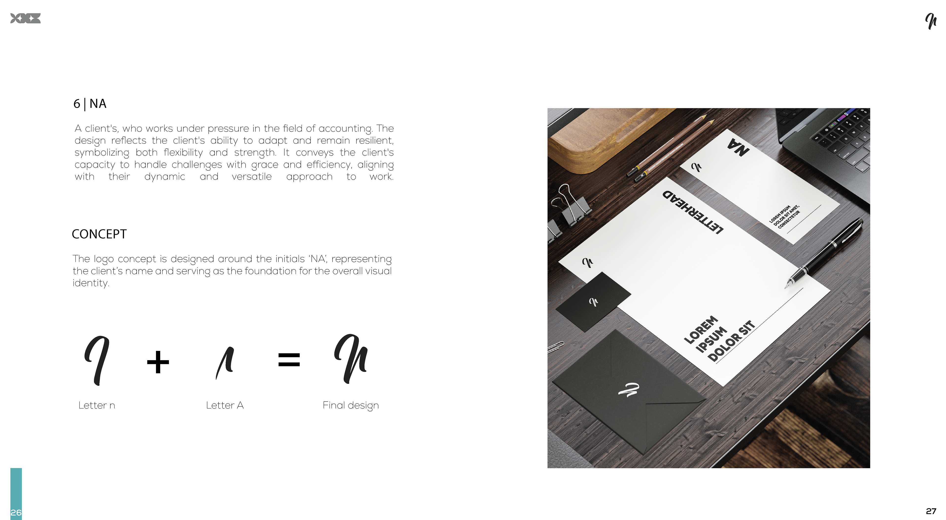
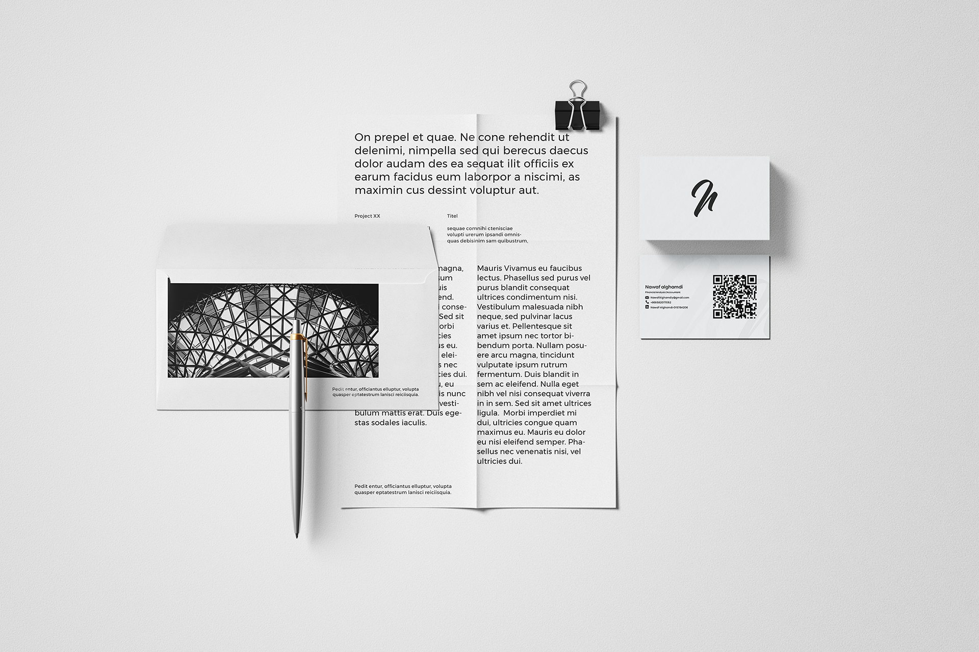
NA
You may also like
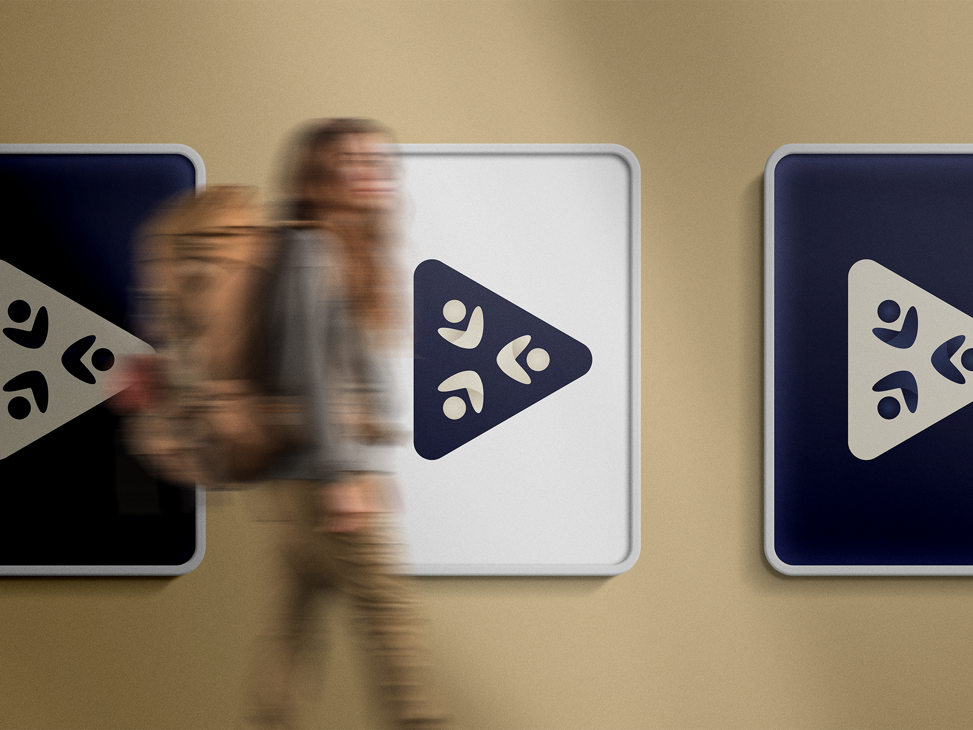
MSR
2022
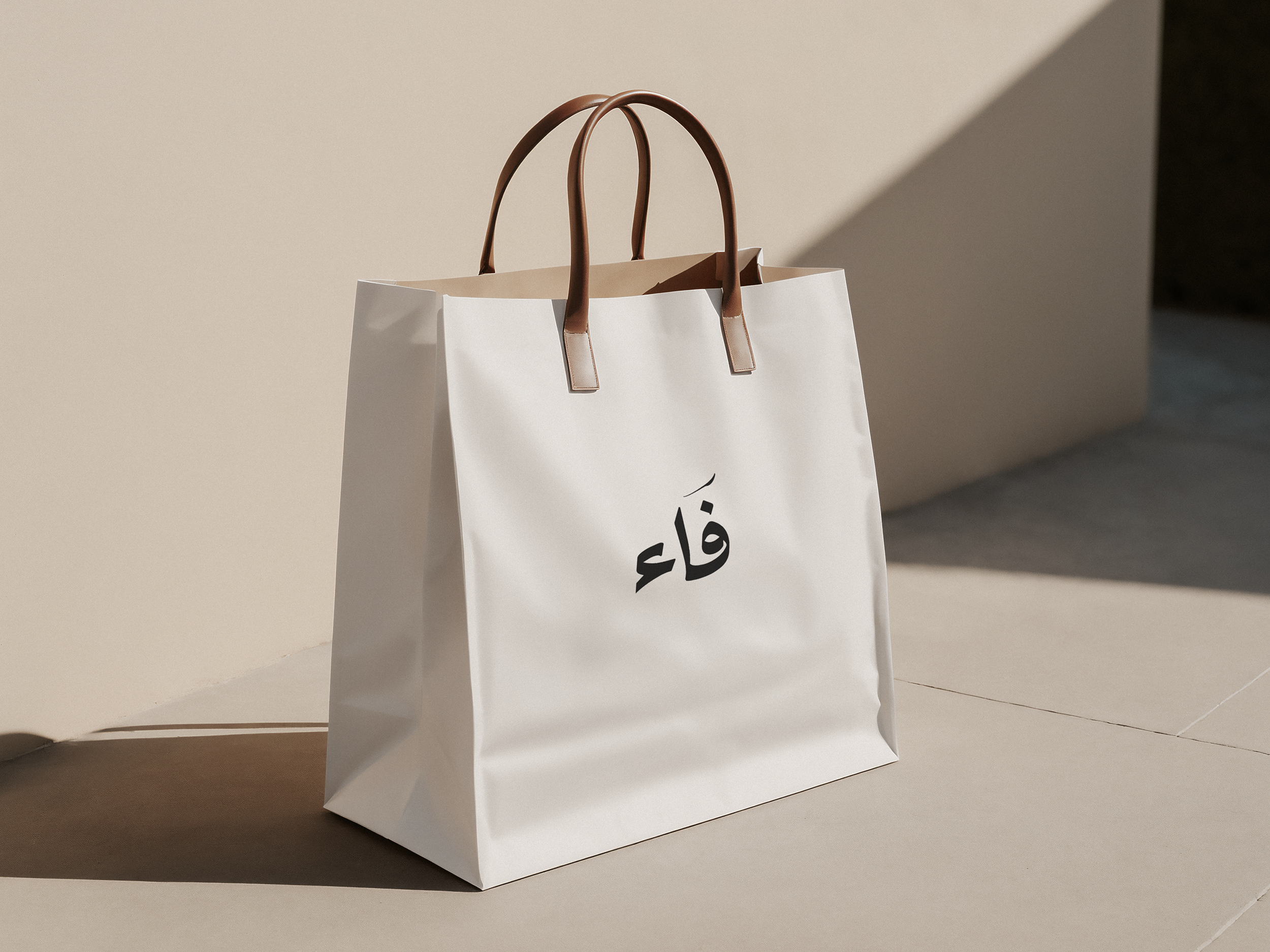
Faa
2025
↑
Back to Top